Reading the data
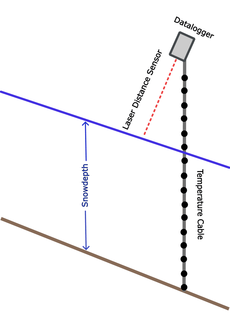
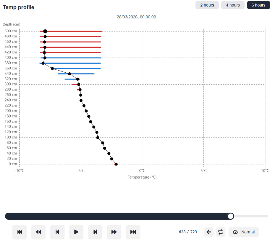
Temperature profile: the chart shows both the current temperature at each temperature sensor and the change in temperature over the last 2, 4 or 6 hours. The x-axis is the temperature and the horizontal lines show the temperature change. If a line is red, the temperature has risen, and if it is blue, it has dropped. The y-axis shows the height of each temperature sensor above the ground. You can view the chart back in time by dragging the slider.
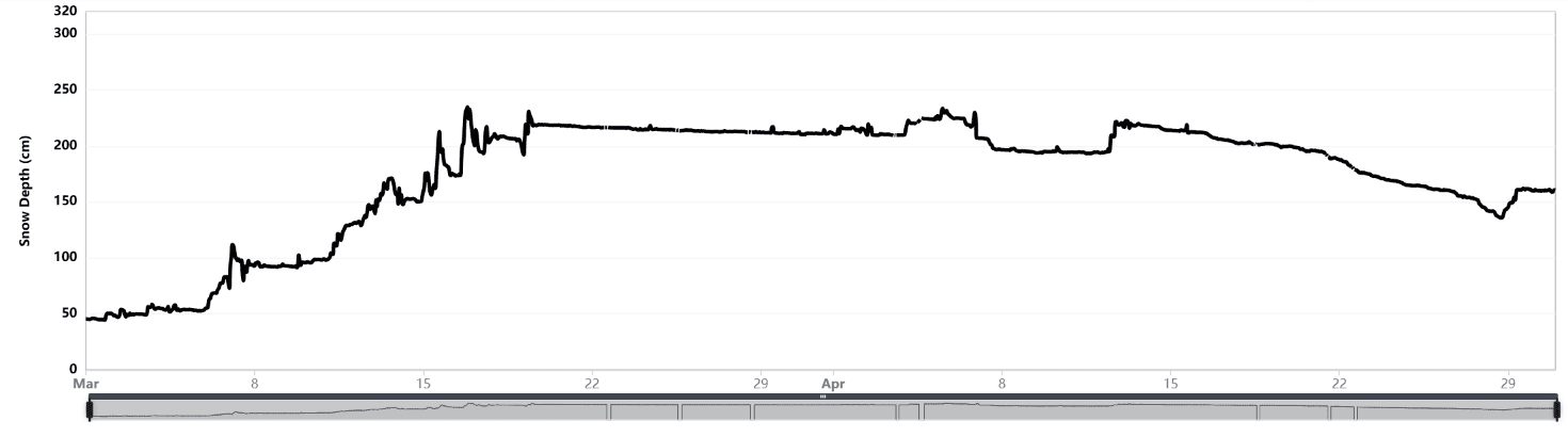
Snow depth (laser): snow depth measured directly by the laser sensor. The laser sometimes drops out because of icing, sunlight or moisture. Filtering is used to remove erroneous laser readings. The laser often points perpendicular to the mountain slope while the cable points vertically, so there can be a difference between the snow depth from the laser and from the algorithm using the temperature sensors.
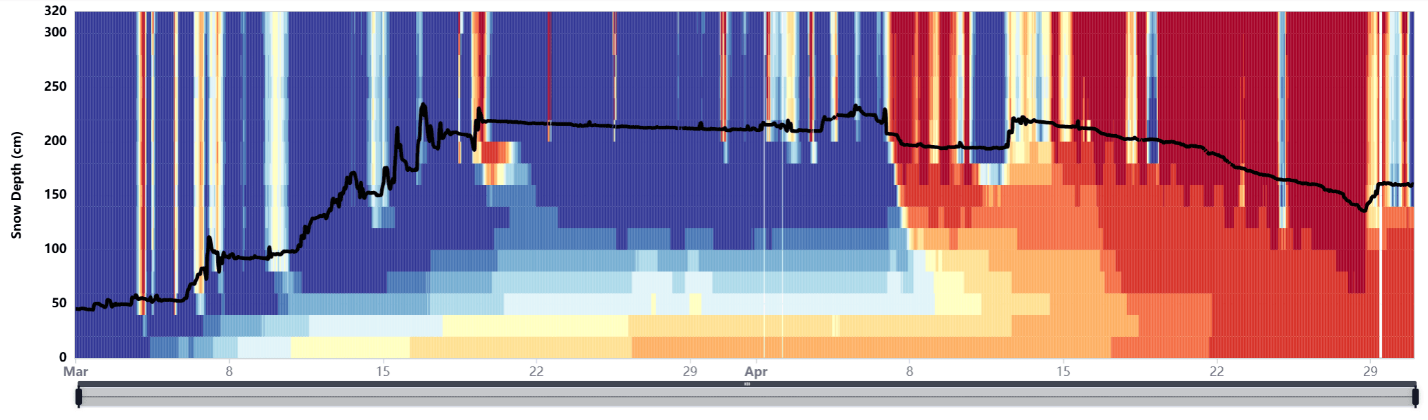
Snow depth with a color chart in the background: snow depth overlaid on the temperature from each sensor. Dark blue is -10 degrees, while red is above freezing.
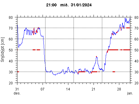
Snow depth (temperature cable): snow depth calculated from the temperature data. An algorithm has been developed to estimate snow depth from the temperature cable data. The accuracy is usually within 10 cm, but it can be slightly slow to respond to sudden changes in snow depth. It is more stable than the laser but not quite as accurate. The horizontal red lines are drawn if the temperature gradient is greater than 1°C per 10 cm (2°C per 20 cm), which indicates that a weak layer has formed.
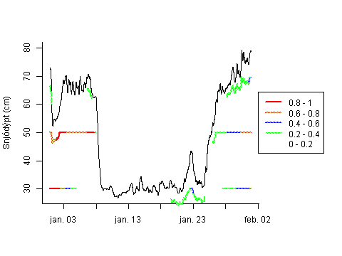
Snowdepth with faceting index: the faceting index is calculated from the temperature sensors. It shows where weak layers are forming by using the temperature gradient between the temperature sensors. A red line indicates angular snow grains, while no line means the snow grains are spherical. These charts show at what depth the weak layers form. Angular crystals bond poorly to each other, so this chart gives important information about the snowpack structure.
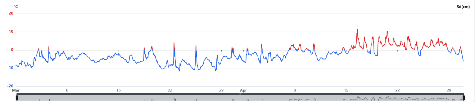
Temperature: shows the temperature at the topmost temperature sensor. If the sun shines on the temperature cable, the temperature can give erroneous values.
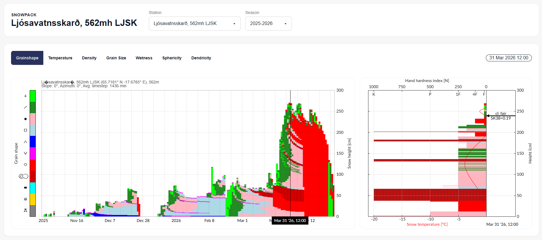
Snowpack model: the SNOWPACK model has been set up for all sensors for the winter of 2026-2027. The model uses snow depth and air temperature from the SM4 sensors, while the rest is taken from the nearest weather station and the MeteoIO generator.
- Below you can see the map used on the data page. All the SM4 sensors are marked on the map, and the main data can be seen on it. You can change the map type, as well as view a slope map, elevation lines, avalanche outlines, and place names. The map uses a color code that is explained here.
- If the change in snow depth over the last 12 hours is less than 20 cm, the marker turns green:
- If the change in snow depth over the last 12 hours is more than 20 cm but less than 50 cm, the marker turns light blue:
- If the change in snow depth over the last 12 hours is more than 50 cm, the marker turns dark blue: